
12. Skins and Visual Design
This sections contains a lot of information intended for developers using the Kartris software. While it is possible for users who are relatively tech savvy (familiar with HTML and CSS) to skin their own site, the majority of end users will benefit from hiring a web developer to do this for them.
A developer should not necessarily require either specialist Kartris or ASP.NET knowledge to develop a skin for Kartris, though use of, or access to a Windows computer with Kartris installed and running is essential in order to test the skin with Kartris.
12.1. Setting a skin
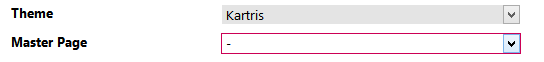
If you leave either selection blank, Kartris will use the defaults (which are the skin 'Kartris' and the 'Template.master' template file).
This menu automatically picks up any new folders added to the /Skins folder within a Kartris site. So all you have to do to import or create a new skin is to place the new folder there and then select it from this menu.
Rather than modify the default Kartris skin, we suggest you clone it, and then select your new skin's name and develop from there.
12.2. Responsive interface and mobile/tablet support
Kartris v2.5 and above features a responsive interface.
The number of users accessing the web on mobile devices is increasing all the time. Although most devices have browsers which can handle web sites designed for bigger screens, the user experience is less than ideal. Kartris incorporates support for 'responsive' design, which enables a web site to dynamically reformat pages to better fit small screens, as well as optimizations for use on touch screens.
12.2.1. Overview of the responsive approach
The original approach to providing support for mobile devices was to create a separate interface, and have the web site check the user-agent of the device requesting the page to decide which version of a page to send. But with the rise of smartphones as perhaps the most common web accessible device, and the increase in power allowing them to run full web browsers with javascript and web standards support, the responsive approach has become the norm.
A responsive web site sends exactly the same pages to all devices - mobile, tablet, laptop and desktop. It is the device itself which decides how to display the page, based on rules and code that is embedded within the page.
The advantages of this approach are:
- Single set of interface code to create and maintain
- Richer experience - full feature set (since not using a separate cut-down interface) and same styling and feel as the main site (because they are essentially the same site with some minor tweaks)
- The interface can be adjusted for a variety of devices of various sizes; for example, tablets can use the chunkier touch-enabled navigation menus while still formatting pages for the larger screen space
- Same URLs for mobile and desktop - since all clients get the same page, there are no separate URLs for the mobile site; this has search engine benefits and also benefits customers who sync bookmarks between their desktop and mobile browsers (because the same URL will work from both devices, but the pages will format appropriately for each device)

12.2.2. The Foundation framework
For more information see http://foundation.zurb.com/
Because Foundation is integrated into Kartris, you can use all its built-in features in your content without needing to fiddle with any javascript. For example, you can easily create lightboxes, slideshows, hover buttons, dropdown menus, tooltips, sticky navigation in either your skins, or your site content, with just some simple HTML. And because Foundation is designed to be responsive, your content will automatically be mobile-friendly.
For an overview of the various Foundation features, see the documentation: http://foundation.zurb.com/docs/
12.2.3. Designing a responsive skin
12.2.3.1. From scratch
12.2.3.2. Modifying an older Kartris skin to be responsive
This is a little more complicated. It's best to use our Template.master as a guide, but we'd strongly recommend starting with a cloned copy of our default skin, and working from there.
First, you will need to add in the extra CSS files; make sure they are in the right order (we tend to put the Foundation and associated files in first, and then override them where needed in custom.css):
<link href="foundation.css" rel="stylesheet" type="text/css" />
<link href="normalize.css" rel="stylesheet" type="text/css" /><link href="custom.css" rel="stylesheet" type="text/css" /><meta name="viewport" content="width=device-width" />http://foundation.zurb.com/docs/components/grid.html
<!DOCTYPE html>
<!--[if IE 8]><html class="no-js lt-ie9" lang="en" ><![endif]-->
<!--[if gt IE 8]><!-->
<html class="no-js" lang="en">
<!--<![endif]--><asp:Literal runat="server" ID="litZeptoJquery"></asp:Literal>
<script>
$(function () {
$(document).foundation();
})
</script>'Add zepto/jquery tag at end of page,
'this is part of the responsive layout
Dim strWebShopFolder As String = CkartrisBLL.WebShopFolder()
litZeptoJquery.Text = "<script>" & vbCrLf & _
"document.write('<script src=JavaScript/'" & vbCrLf & _
"+ ('__proto__' in {} ? 'zepto' : 'jquery')" & vbCrLf & _
"+ '.js><\/script>');" & vbCrLf & _
"</script><script src=JavaScript/foundation.js></script>"
12.2.3.3. Old IE support
Because there are still a number of users stuck on older versions of Internet Explorer, we have built in support to deliver a non-responsive version of the site to them.
To create a non-responsive version of your skin for users on IE8 and earlier, it should be called the same as your main skin, but with 'NonResponsive' added to the name. For example, we ship Kartris with a default skin called 'Kartris', and the non-responsive version of this is therefore called 'KartrisNonResponsive'.
If you're upgrading a site to the responsive version of Kartris, you could keep your old skin and rename it to be used as the non-responsive skin.
From January 2016, Microsoft will only support the latest version of its browser available on each platform, which effectively means IE8 is no longer supported (as Vista can run IE9). From this date, the requirement to service older browsers should cease as they are no longer supported with security fixes, and every browser vendor will be delivering regular browser updates automatically by default.
12.3. Required skins
If you wish to support browsers below IE8, and have a modern responsive skin on your site, you can also add a non-responsive skin for older browsers. Please see @13.2.3.3. Old IE support.